TYPE FONT IDENTIFICATION
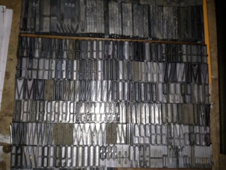
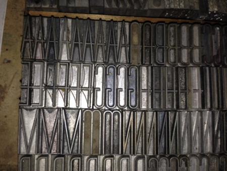
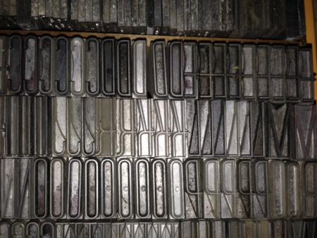
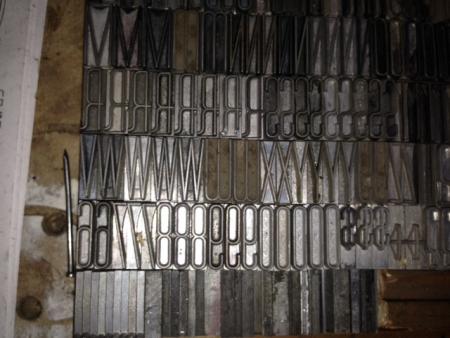
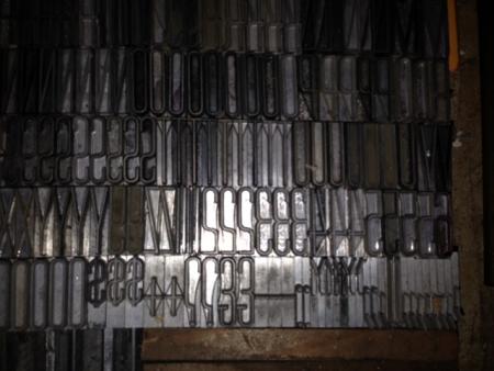
Any help would be greatly appreciated in identifying this font. Is it Empire with some alternate letters included?
E1.JPG
E2.JPG
E3.JPG
E4.JPG
E5.JPG
ffi |
fl |
5m |
4m |
’ |
k |
e |
1 |
2 |
3 |
4 |
5 |
6 |
7 |
8 |
$ |
@ |
# |
Æ |
Π|
æ |
œ |
|||||
j |
b |
c |
d |
i |
s |
f |
g |
ff |
9 |
A |
B |
C |
D |
E |
F |
G |
||||||||||
? |
fi |
0 |
||||||||||||||||||||||||
H |
I |
K |
L |
M |
N |
O |
||||||||||||||||||||
Any help would be greatly appreciated in identifying this font. Is it Empire with some alternate letters included?
E1.JPG
E2.JPG
E3.JPG
E4.JPG
E5.JPG
Huxley Verticle
image.jpg
FOLLOW ON QUESTION: I have a run of this typeface….but have always wondered about certain letters that are different. Example there are two different styles of the letter A, K & M. Why is this?? S.Alt
Thanks for the info!!
While Empire, a condensed face that came out slightly after Huxley Verticle is straight forward and has only one version of each character, Huxley Verticle includes alternate characters for A, K, M, N, W and Y. It is a really classic Art Deco style and the alternate characters allow you to add some panache when you set it. It really “swings.”
Rick
Many faces were supplied with alternates. Sometimes they were provided specifically for the beginning, middle or end of a word. Swash alternates are also relatively common and frequently used inappropriately by the inexperienced newbie. “Use sparingly” is the best guidance for the latter.
Maybe a project for the winterto come up with a count, but I would dare to say that relatively few fonts were designed with alternate characters.
I can tell you that Will Ransom eventually regretted that he ever designed the oversized ascenders and descenders for Parsons because of their constant misuse by printers going crazy and trying to insert them whenever possible into their settings. They there meant to be a subtle touch on a page and used very sparingly. He also loathed that BB&S added their own alternate of M and N.
More contemporarily, Herb Lubalin regretted releasing Avante Garde because of its misuse by ‘graphic designers.’
Rick
With apologies to Ink Sprite. I actually took a quick cruise through Mac McGrews book and much to my surprise, I tallied over 130 fonts with alternate characters!!!!! And another dozen or so that simply had one or two alternate characters. I did NOT count fonts with extra ligatures and things like that.
This is not even starting to look through 19th century or European fonts.
.
A lot of this count were italic faces with alternate swashy caps.
Mac McGrew stated that he would not include Initial fonts in his book, but actually included a few of them anyway. He said they would take up too much room. So I did look into that several years ago and he was right. I counted a total of 76 of them just for American metal typefaces in the 20th century.
So, like the man in the orthopedic shoes, I stand corrected.
Rick
McGrew has an entry for a faced named “Sans Serif”, issued from 1930, that was in fact a copy of the new and popular Kabel. He notes that Monotype later issued an extensive set of alternate characters for “Sans Serif” designed to make the face approximate to Futura, and another set to make it look like Bernhard Gothic.
That’s the most extensive case of alternates I’ve seen. I may have run across one or two similar ones. I have the impression that this was an idea that was, in a general way, in the air at the time, though not common, marking an experimental stage in the evolution of the idea of what a typeface is.
Judging from my experience in job shops of a later era, you may be sure that every week, from the early 30s until the end of the metal era, some job shop somewhere received, from a client who had no idea what it was, a printed piece set in Monotype “Sans Serif” using a random assortment of alternates, with the demand to “match the face” for the client’s job.
Ken -
Great observation and something that most people don’t know about.
McGrew’s write-up about San Serf in his book is well worth reading. At the end he mentions that Kabel was less mechnical than Futura and that Kabel initially had greater impact than Futura, but that Futura eventually became more popular and lasting. All of that is true, BUT the reason that it became more popular with printers is the fact that they would have to pay a higher cost to buy Kabel because it had to be imported from Europe.
Rick
Thank you for having this discussion. I am learning so much from all of you.
Thank you for having this discussion. I am learning so much from all of you.