Capital A looks like a compass metal is very dark and soft
I have searched online and can’t find anything comparable. I don’t have any lowercase letters, perhaps they don’t exist? I found this font in a tray with 2 separate labels: Fancy and Flowers. There were 2 fonts stored together in the same tray and the other font didn’t resemble this one at all. Both fonts, however were made from the same very dark metal. The other set was almost completely worn down and will probably have to be scrapped.
I am not familiar with metal types. Can someone tell me why it is so much darker and softer than my other types? I have posted a photo for comparison.
Also, there is a large pinhole on the side. My other types do not have that. Does that mean this is monotype? I am still learning and though I have researched am still not clear on the difference between foundry and monotype.
Thanks again for all the help!
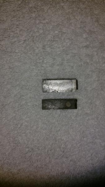
darktypecomparison.jpg
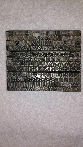
compass.jpg
To a UK printer, the pinmark means foundry cast type, not Monotype, and the curved nick quite often ( but not always) would tend to confirm this. Dark and soft metal, badly worn suggests one of those continental imports of about 1936 or so, where the alloy used wasn’t near as good as, say Stephenson, Blakes stuff. It may be worth examining several characters with a glass - there may be some letters or a logo in the pinmark that would be informative. .
If you are in England or on the continent I don’t know what to tell you.
Here in the United States this face was named Caprice and the design is credited to Arthur M. Barnhart and was patented on February 7, 1888 and cast by Barnhart Bros. & Spindler in Chicago, IL.
Rick
Indeed, there was a logo in the pinmark. I never would have thought to look there. BB&S Chicago with a #18 in the center. I’ve been doing a little research on the foundry, so it looks like the type is pre 1911. I still can’t figure out the font. I assumed #18 would be easy to find, but it isn’t. I downloaded their 1907 book of type specimens and can’t find it in there. I’ll keep searching. Going through more trays today I found two more that look like the same dark metal. I’ll check those out later.
Here is a link to the 1899 Barnhart Brothers and Spindler catalog (on Hathitrust Library site):
https://babel.hathitrust.org/cgi/pt?id=uc1.31822038209771;view=1up;seq=2...
The 18 you see in the pin mark has nothing to do with identifying the typeface; it stands for the size of the type: 18 point. BB&S should be good, hard foundry type, so I don’t know what sort of type you are comparing your type to.
—Bob
The #18 probably refers to the point size… Although maybe not.
I did find reference to Caprice being in their 19th century catalogs but not their 20th century ones so you might see if you can find an earlier catalog.
Yes, Caprice, that’s it! Thank you everyone. It was becoming an obsession.
FWIW the other type in the tray had a different logo in the pinhole. Not BB&S. It was a triangle. That was the type that was completely worn down.