Garamond Look Alike
We think this is in the Garamond family, but the J is illusive and doesn’t match in our type ID books. Any suggestions?
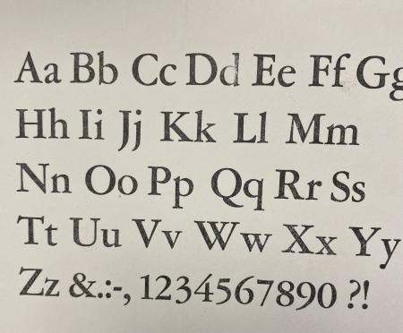
IMG_0101.jpg
ffi |
fl |
5m |
4m |
’ |
k |
e |
1 |
2 |
3 |
4 |
5 |
6 |
7 |
8 |
$ |
@ |
# |
Æ |
Π|
æ |
œ |
|||||
j |
b |
c |
d |
i |
s |
f |
g |
ff |
9 |
A |
B |
C |
D |
E |
F |
G |
||||||||||
? |
fi |
0 |
||||||||||||||||||||||||
H |
I |
K |
L |
M |
N |
O |
||||||||||||||||||||
We think this is in the Garamond family, but the J is illusive and doesn’t match in our type ID books. Any suggestions?
IMG_0101.jpg
Amsterdam, ATF, Stempel, Bauer, Wagner, etc, cast Garamond, ca 64 diffeent versions in Metal and 189 in Digital. And you go by one (1) Book , just asking
typenut, how many versions of Garamond you looked at were bold and didn’t have a ball on the J? Also just asking.
Take a look at Adobe Garamond.
https://fonts.adobe.com/fonts/adobe-garamond
Adobe Garamond Pro Regular
Paralell-Imp, all of them are fully fleshed out Families, because of copyright issues, they are all very close. I wrote it up in a Magazine I can’t remember. The closest Garamont to the Original is the Amsterdam one, Imprimery Nationalle has the Oeiginal, as the Roman du Roi, only for their use.
Look, I have versions of Garamond from M&H in handset, linecasting families from Linotype and Intertype and Ludlow, and even more digital versions.
What bold J has no ball? THAT is the question that would inform the original post.
parallel, the Adobe digital font has the lower case j without the ball. See Adobe Garamond Pro Bold at https://fonts.adobe.com/fonts/adobe-garamond#fonts-section
IMG_20210717_100444941.jpg
The so called Amsterdam Garamont (yes with a ‘t’) is actually the ATF Garamond. The foundry bought the mats in the early 1920s from the American foundry and started issuing the 35 different sizes around 1926. In the 1927 type specimen the LA announces 13 sizes for the roman, 12 sizes for the semi-bold and 10 sizes for the italic version.
The original photo above shows type that matches ATF Garamond Bold.
The missing “ball” on the cap J is apparently broken off the J that was used to make the proof.
Michael Vickey
Nickel Plate Press
ATF-GarBold.JPG
Hi All,
Thank you for your contributions. After Michael mentioned the J is broken I took a closer look and yes there is tiny, but obvious break and unfortunately we only had one J so we could not compare earlier. Thanks for solving this one!