Print Shop paint scheme
Perhaps some of you machinists, pressmen, printers and others will remember: what was the wall paint scheme like in industrial printing spaces? Obviously, most are probably just off white, but I have seen lower walls painted black while the upper was white. If anyone knows, was there any special rationale for certain colors used etc., or are things like this just random? I am getting ready to paint the space at my school and I want to get it right (if there is something to get right!) so that it is correct for c. 1930.
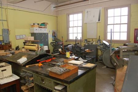
EliotPress4.jpg
You can see a lot of old print shop walls in this old Flickr photo set of mine-
http://www.flickr.com/photos/thearm/sets/72157607475643872/
Not much that I’d say was a good idea there though! Just do what you think will look good and take some abuse and touch up easily.
Dan
Wow, Dan - every pic looks like a great story!
I am not sure about c.1930’s shops as most photographic images are black and white, but today color viewing areas within a plant are often Munsell N7 or N8 gray to meet ISO 3664:2009 standards.
I found your question to be of personal interest as I’m presently in the (long) process of rebuilding my barn into a typefoundry and printing shop. So I started to look around both in my own library and online, and discovered that it is actually quite difficult to find a *color* photograph of the interior of any industrial building from this period. I hope that others might locate some!
So while I have no real answer for you (or myself, for that matter), here are some bits and pieces which may be of use. Most of them deal primarily with cleanliness and lighting, and only incidentally with paint and color.
A short article on “How I Keep My Plant Clean” from Factory magazine, Vol. 15, No. 2 (August 1915): p. 98. It suggests a three-level paint scheme to hide the dirt near the floor:
http://www.galleyrack.com/temp/factory-v015-n02-1915-08-p98-paint.pdf
An article from American Pressman, January 1918 (the volume numbering is uncertain) advocating two-color walls with a light upper portion:
http://www.galleyrack.com/temp/american-pressman-1918-january-p021-img08...
An article from Electrical World, Vol. 76, No. 24 (1920-12-11) on Printing Plant Illumination (see the captions to the photos on p. 1155 for its advocacy of white tile and enamel paint):
http://www.galleyrack.com/temp/electrical-world-v76-n24-1920-12-11-googl...
An article from The Inland Printer, Vol. 91, No. 1 (1933-04) insisting that “Paint Can Be the Printer’s Friend” (written by a paint company!) My scan (so it’s a larger file). They recommend eggshell white:
http://www.galleyrack.com/temp/inland-printer-v091-n1-1933-04-pp50-52-pa...
Finally, as a tantalizing indication that there is more research that could be done, here’s a screengrab of a Google Books citation for Factory and Industrial Management magazine in 1930 (your year exactly) which looks as if it might give recommended interior color schemes:
http://www.galleyrack.com/temp/factory-and-industrial-management-1930-pa...
Regards,
David M.
www.CircuitousRoot.com
Hot dog, guys - thanks for the great info. I have seen a few color plates of new buildings and interiors from the era, but as pointed out, B & W only of industrial buildings - Maybe I should look up deserted buildings like the Packard plant in Detroit and see what evidence might still exist!
Actually the answer is quite simple… Any light colour paint would have had a lead base. Heating (and probably lighting) would have been by oil, coal or gas, so sulphur would have been in the air, and the paint would have darkened to a yellow ochre shade… and added to that most of the staff would have smoked on the job… adding a nicotine yellow to the mix. The result would have been something like Pantone 458, greyer when young and yellower when old. Lower levels would probably have had a wooden surface rather than plaster, to resist knocks, and this would have probably been dark stained and varnished.
At times the picture may have been a bit brighter on the paint side, at least. There was some advocacy at this time (early 20th c.) for zinc-based rather than lead-based paints in factory situations. For the most part the lack of equivalent toxicity is the reason cited, but my 1940 edition of Audel’s “Millwrights’ and Mechanics’ Guide” draws attention to the lack of effect of sulphur in the air upon them.
For a very slightly later set of suggested practices, here is an extract from “Production Handbook,” edited by L. P. Alford and John R. Bangs (NY: The Ronald Press Co., 1947 [but copyright 1944]):
www.galleyrack.com/temp/alford-bangs-1947-production-handbook-paint-0150...
(My apologies for the quality of the scan - I had to reduce the resolution significantly to keep the file size down.)
Of course, if your target date is 1930, this may be misleading - by the end of the war much was changing in factory planning.
Regards,
David M.
www.CircuitousRoot.com
duffmo, There is a site www.shorpy.com it is a photo-archive.
There are great images from our past.
best james
Again, you are all the greatest! Thanks for all the excellent info!
Again, you are all the greatest! Thanks for all the excellent info!
Again, you are all the greatest! Thanks for all the excellent info!