Identifying a Chromatic Font
Hello
Just wondering if anyone can identify this two colour wood font? I have had a look at what is online and can’t find anything that looks like it. It is an approximately 18 line font. It is very exactly cut from a fine grain wood and is in great condition for its age apart from the very damaged “W”s. Someone evidently took exception to that letter! There is no maker’s mark on any of the letters.
As you may notice from the proof I carelessly printed the “K” in the wrong order, but I suppose the font could just as well work in reverse.
Any assistance is much appreciated.
Derek
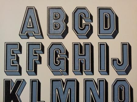
Chromatic Font 1.jpg
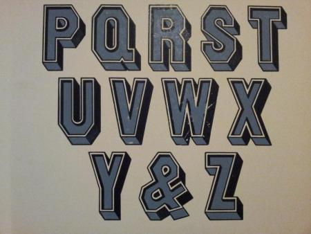
Chromatic Font 2.jpg
Gothic Paneled by William H. Page.
US Design Patent No 7,230, March 3, 1874 (filed Jan 5, 1874) and first shown in Page’s Specimens of Chromatic Wood Type, Borders, Etc. Page also showed a Gothic Paneled No 2 in the same specimen book, the only difference appears to be a bit of additional inlining on the “neck/beard” (for the lack of a clearer description) portion of the letter. Page appears to have been the only manufacturer that sold this face.
Page sold single color versions as well named Paneled Condensed, Paneled Condensed No 1 and Paneled No 3. Hamilton renamed these faces—after the 1891 acquisition—No 481, No 490 and 467 respectively.
Hamilton also offered a No 465 and No 470 in the same style each with a different positive negative color field relationship (it is unclear from the specimen record if these were also Page faces as they do not show up in specimen books before 1891.)
David
Hey Derek,
What a nice find. How about some photos of the actual type?
Daniel Morris
The Arm Letterpress
Brooklyn, NY
Looks like the K was printed with the Black fill and the blue shadow. Its nice to know it works well with both.
Would also love to see a sample of each color printed separately
(I suspect that might answer how Hamilton offered two other configurations of the negative/positive relationship).
And I’ll second Dan’s “nice find.”
Thanks David for all the information. It is a much earlier date than I expected. I am printing posters on my Albion this weekend (as part of an open day at the local arts centre) so will take separate proofs of both sets. The black overprint has shading on the oblique lower sides of some letters (B, C, D, J, & etc) but this isn’t showing very well in the pics. They were a little clogged by what I presume is a combination of old varnish, ink and years of dust. Have very carefully scraped it with a fine point as much as I am game to. Would you happen to have a picture of the original colours in the Page Specimen Book? It would be great to print the posters in authentic style.
Hello Dan. I have only cleaned a portion of the type so far, but will take some pics. I think it has upward of 50 years of dust on top of it. Unfortunately it is only borrowed and is part of a large collection owned by a 4th generation printing firm, that acquired it when an even older printery closed down over 60 years ago. They very generously allow me access to it and I am hoping to shortly begin documenting the collection with a folio specimen book. It is not all as exciting as this specimen, but it is a large intact collection and historically representative of commercial printing in Australia. Have so far been using it for some poster work.
SSS Poster2.jpg