Font Identification
Could someone help me identify the font on this type?
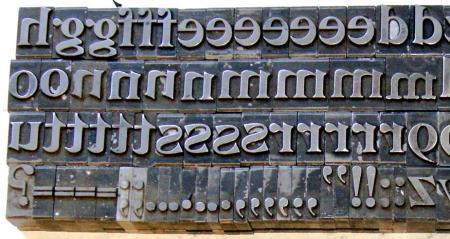
Lead Foundry Type Letterpress Set - No. 03 - 03.jpg
ffi |
fl |
5m |
4m |
’ |
k |
e |
1 |
2 |
3 |
4 |
5 |
6 |
7 |
8 |
$ |
@ |
# |
Æ |
Π|
æ |
œ |
|||||
j |
b |
c |
d |
i |
s |
f |
g |
ff |
9 |
A |
B |
C |
D |
E |
F |
G |
||||||||||
? |
fi |
0 |
||||||||||||||||||||||||
H |
I |
K |
L |
M |
N |
O |
||||||||||||||||||||
Could someone help me identify the font on this type?
Lead Foundry Type Letterpress Set - No. 03 - 03.jpg
Also DeVinne Bold.
Bob
When did fonts begin showing up on type?
Metal type has always been put up in fonts.
Bob
Looks like Goudy to me
That wasn’t the question. But your reply does underline how the misuse of correct terminology is so easily accepted by the ill-informed.
This particular FACE (the design itself) first showed up in type in 1893 as a FONT (a complete assortment of all the components of this face).
Not even close to resembling anything by Goudy.
Rick
There are at least 2 different typefaces represented in the photo. Note especially the “m” and “n”.
Michael
Pleased to see someone grasps correct terminology. :o)
It looks more like a couple of u characters have been turned upside down and accidentally put in with the n…
The one m” is definitely a wrong font. A couple of the “n”s are simply upside-down “u”s and the second “s” is also upside-down. The “u” before the “t”s is also an upside-down “n”.
Rick
Not DeVinne Bold, it is just pain old DeVinne.
DeVinne, designed by Gustave Schroeder, and patented in his name in 1893. It was issued originally by Central Type Foundry in St. Louis, and was the result of a correspondence between Theodore Low DeVinne, the head of the DeVinne Press in New York City, and Mr. J. A St. John of the foundry in discussion of the need for plainer display types. It was a rather heavy face, later thinned down as a book face by Frederic Goudy in 1898, his second type design. The type you show seems to be the first incarnation of this type, not the later bold issued by Barnhart Brothers and Spindler in Chicago, which was a much wider face.