Looking for help identifying metal type
Hello, I’m looking for help identifying these 4 sets of metal letterpress. They should be american made type, and I don’t see any numbering to identify them on the H or M like a lot of sets have.
Any help would be greatly appreciated.
Thanks,
Jason
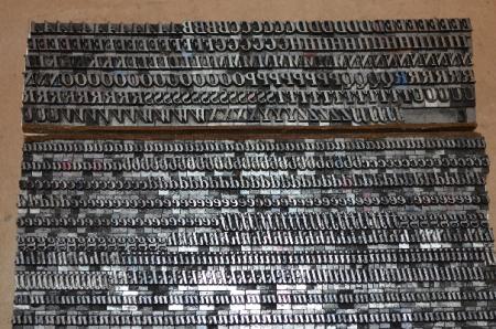
DSC_4129.JPG
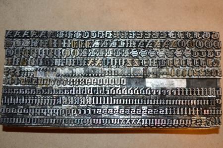
DSC_4141.JPG
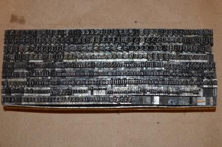
DSC_4147.JPG
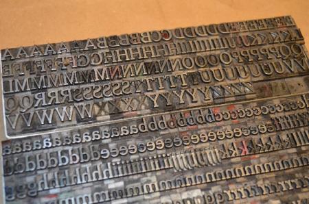
DSC_4138.JPG
Re 4141: I’m a fan of black letter and despite being a Brit with only a couple of basic reference books to American faces (McGrew and Lieberman), I’ve taken the bait and tried to identify this face.
The right hand of the two C in the fist line is actually a T.
It’s a mainstream black letter face - i.e its not one of the very distinctive ones such as Cathederal Text.
Its not Goudy Text or Flemish Black or Engravers Old English or Engravers Old Black or Wedding Text.
By elimination, Cloister Black / Cloister Text seemed likely but A, I and the righthand of the three dollar sign doesn’t accord with McGrew’s showing (though the other two do - is this a mixture of sorts maybe?), and I cannot see the alternative forms of V and W that McGrew flags up. So it’s not Cloister Black / Cloister Text
Might it be a Linotyope face? - I can’t find a specimen of Linotype Cloister to compare.
In desperation, I turned to the British black letter faces that continued in production until a reasonably late date (I do not think this is an especially old casting): its not Festival Text or Saxon Black or Monotype Light English Text.
The photo is not quite as clear as would be ideal. Printing the face up would make the task far easier.
I’m afraid I’ll have to yield to whatever expert Americans that can do better than I can!
The bottom photo looks suspiciously like Cheltenham OS or Medium. The other photos aren’t really clear enough to work with — proofs of the fonts would make life a lot easier! Or sharp straight-on photos of the type. Maybe because Briar Press resizes the photos, post larger ones on Flickr or somewhere and give a link to them. I like to flop the photo so I can look at the letters as though they were printed, but that’s no good with these small photos. Sorry!
Bob
Well, this seems like a no-brainer to me. The photos aren’t the clearest, but in order of appearance I would say you have:
Bodoni Bold Italic
Engravers Old English Bold
Wedding Text
Cheltenham Medium
All standard faces found in most commercial letterpress shops ‘back in the day.’
Rick
Awesome, thank you all for your responses and time researching! I wish I could show a printed impression of the type, but the only press I have needs a recondition on the rollers and a bit of rehab.
Re: 4141: you’re probably correct Rick - I only looked at Engravers Old English and Engravers Old Black, both of which are of notuicably narrower measure. I overlooked Engravers Old English Bold!
To be certain, it would be good to see it printed up. There are a few details that don’t seem to quite agree with McGre’s showing of this face: I can’t see the little squiggle below the H, the vertical traite on the L seems longer, the lines on the dollar sign seem to be vertical rather than slightly inclined. However, the distinctive curved top of the numeral 1 is present.
4147 wasn’t a clear enough photo for me to study as closely as 4141.
Free Presse,
Note in McGrew that there is an alternate cap H. Both versions are shown in the pictured font. L looks right to me as do the ever-so-slightly inclinded hash lines on the dollar sign.
4147 includes the telltale multiple ligatures that are only found in that combination in Wedding Text.
As a side note on Engravers Old English. There was a local typography shop in Des Moines, IA that used handset 24 pt. Engravers Old English to set graduate’s names on diplomas for a large high school each year. I had a standing request to get any of that I could find in my travels and raids of old print shops and he would buy it all from me. I actually did find a few fonts for them. When they finally closed a few decades ago, I ended up with the bulk of their handset type. Needless to say, I have a VERY LARGE font of 24 pt. Engravers Old English (24 A’s).
Because of that “raid” I also became a Master of the Univers.
Rick
I had a sale some years back for Engravers Old English from a printer in Mexico that did all the diplomas for the universities in Mexico, but they needed Spanish accents, so Theo Rehak located the 24 pt mats and cast a dozen fonts of just the accented characters and I still have a few of those fonts in stock.
Fritz
I gladly bow to your superior knowledge of Engravers Old English, Rick! Its a face rarely if ever encountered in the UK.
A 24A font in 24pt must occupy at least three job/Californain cases or an upper case and two lower cases! I thought we had an unusual amount of black letter (Goudy Text is one of our house faces) but we couldn’t hold a candle to that sort size of font…
Robert
Robert,
Glad to hear that you have Goudy Text. In my opinion it is the very best black letter font for beauty and legibilty. I hope that you also have some Lombardic Initials (also by Goudy) to go with it because they make an awesome combination that is hard to beat.
My font of 24 pt. Engravers Old English completely fills a 10” x 16” galley, set with thin strips of chipboard between each line. This makes it easy to use the font. My general rule is that type 18 pt. or larger can be stored on galleys because it is generally not used to set body copy and mostly used for headlines, etc.
I have ten galley cabinets and 35 typecase cabinets in the shop. I have over 2,000 fonts of type, so storage space is at a premium. Most galleys contain at least two fonts of type.
Rick
Goudy’s type designs are of consuming interest. Our other house face is Goudy Old Style. This, and Goudy Text are the only designs of his that might be remotely termed common in the UK. Goudy Catalogue is encountered with similar frequency in the UK but, as I’m sure you know, it was named after, rather than designed by, Goudy. His Lombardic Initials are regretfully rare in the UK - it would be nice to obtain a set but the liklihood of seeing them for sale is miniscule.
Yes, its funny how galleys fill up with everything except standing matter. We try to keep fonts up to and including 36pt in cases but inevitably fonts migrate to galleys…
500 cases plus 120 galleys of type - astonishing. Presumably the result of collecting at the right time and being prepared to travel and to commit a fair amount of money. Well done! Was it you who posted earlier this year “He who dies with the most type, wins!”?
Robert
Rick wins, he has more type than most foundries.
I started collecting type in the mid 70’s. I was in the right place at the right and consider myself very lucky to have had the chance to accumulated all of this. But we are, after all, just the temporary custodians so someday hopefully it will all find its way into other shops.
I am by no means the one with the most type. There are several others I can think of with MUCH larger collections than I have.
I have always sought and gathered the fonts that I wanted to play with. Along the way, sometimes others were brought home as a “take it all” deal. I have always tried to pass along duplicates, etc. to those trying to get started so the craft can be perpetuated.
Another saying that I am partial to is “There are but two kinds of type: the type you have and the type you don’t have. The type you don’t have is always better.”
Rick