Font Identification
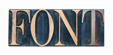
Can someone please help me identify this font. I think perhaps it is a Cheltenham.
Font - 078487.jpg
ffi |
fl |
5m |
4m |
’ |
k |
e |
1 |
2 |
3 |
4 |
5 |
6 |
7 |
8 |
$ |
@ |
# |
Æ |
Π|
æ |
œ |
|||||
j |
b |
c |
d |
i |
s |
f |
g |
ff |
9 |
A |
B |
C |
D |
E |
F |
G |
||||||||||
? |
fi |
0 |
||||||||||||||||||||||||
H |
I |
K |
L |
M |
N |
O |
||||||||||||||||||||
Can someone please help me identify this font. I think perhaps it is a Cheltenham.
Font - 078487.jpg
Not Cheltenham - the serifs on the ‘T’ are too long and the ‘O’ i too ovate.
It’s similar to Latin Oldstyle.
The font is Century Nova, designed in 1964 by Charles E. Hughes. Cast in metal by Monotype and cut in wood for the showcard press makers. Curiously, it has about the same proportions as the original Century face made 70 years earlier. My guess it that there is a grove on the bottom of this type to fit on the channel strips in the showcard presses.
Rick
Opps. “grove” should read “groove” above.
Rick
Rick,
Thanks for the info and yes each piece of type has 3 grooves in it. I attached a photo.
Bossard
Wood Type Letterpress Set - No. 21 - 06.jpg
Century Nova was also cut and cast by ATF, but I’m not sure how long they sold it before winding down operations.
DGM