What’s My Type?
Twenty-five years ago I purchased multiple drawers of wood type at a printer’s auction. I now wish to restore these 12 sets, have a new cabinet built, and display them. The letters range in size from 3 ½” to 1 ½” high.
I am seeking information about the names of the typeface and, if possible, an approximate age. I also would like to know of a good way to clean the type.
I consider the type as “art.” Not to be incorporated in a coffee table or arty display. Just my type.
ADDENDUM: I now have a download of the type, and thanks to kind suggestions, I know that the type is from Hamilton, and if I have read their website correctly, it would have been created sometime between 1880 and 1888, when they stopped doing veneers.
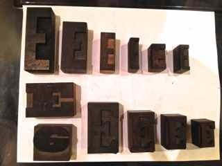
The Letter E.jpg
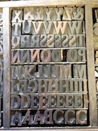
Antique Extended.jpg
Hamilton.jpg
Hello J.E.,
I could help you in both of your questions. In the arena of type identification, though, there are many others on this site that far surpass my knowledge. For anyone to help with the ID they will need numerous clear photographs of both the entire font, plus details of at least a couple of characters. Further, most type ID, including the estimated date of manufacture, needs the upper case “A” examined. Specifically, look for on one of the sides of these characters a maker’s stamp, naming the company that made them. Not all wood type will have such a mark, but many do and this greatly aids the ID process.
For cleaning the type, photographs will be needed again to give you an accurate set of steps to clean the wood without damaging it.
Look for others to respond, and if you would like, contact me off-site to discuss this further. Go wood type!!
Sincerely,
Jim
You might wish to seek out the book American Wood Type: 1828-1900, by Rob Roy Kelly. It would answer a lot of your questions about history, how it was made, &c.
Paul
The photo of the group of characters (titled as Hamilton.jpg)
is most likely Cheltenham Condensed, but I can’t see all the sorts clearly enough to confirm. Also, the upper case “E” that is Antique Expanded is followed by a lower case “e”, which is upside down, and I don’t know for sure what font it is from.
Jim
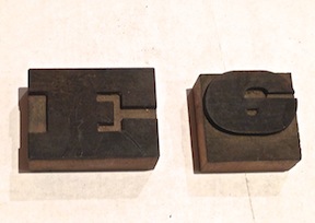
Again, my thanks to Jim for his comments and input. Somewhere, I recalled, I had purchased a book on wood type; last night, in perusing my book shelves, I discovered the Kelly book that Paul had recommended and Jim urged me to check. Page 161 presented Cheltenham Condensed, which has a strong resemblance to one of my sets, with the exception of the letter “E.” The variance is in the center bar.
The right of the horizontal segment is rounded, as is true in Kelly, but in mine, the left top and bottom of the vertical is also rounded.
I have been to the Center for the Book in San Francisco and will confer with one of the staff. The search goes on!
Perhaps contact Hamilton Type Museum? They would know.