Wood Type in San Francisco Bay Area
I asked and did indeed get many leads regarding the twelve plus sets of wood type I aquired a number of years ago. I would like now to confer with someone person-to-person. Can anyone suggest someone in the Bay Area whom I might contact? I have been to the Center for the Book and Arion Press, but both are more concerned with metal type.
Thank you.
The Letter E.jpg
Hi Judith - not sure what your question is. I’m in Oakland.
Judith,
You might look some of them up on this site. It will not pin down exactly who made the type but usually will list all manufacturers who made the style.
http://www.utexas.edu/cofa/rrk/index.php
Good hunting.
Mike
To clarify my query is, is there a local person with a good knowledge of wood type who could look at my collection and help with identification and whatever else might be interesting about it?
I know that some of the sets are Hamilton, and I have contacted the museum and also looked at the Kelly book and even had e-mail correspondence with the Kelly Collection people.
I plan on taking more photos, which I will send on to an out-of-town expert whose name was passed on to me. I would just like to connect now with someone locally who can see/handle the type - in person.
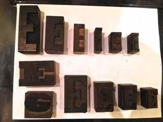
Hi Judith,
We need a little better imagery to help you, and perhaps include a few characters of each font instead of just the E. Perhaps at least an A and an E.
You first row of Gothics can simply be i.d.’d as (left to right): Gothic Extra Condensed, Gothic Condensed, Gothic Extra Condensed (Note the extended middle crossbar which indicates that this may be a little more special, but again more characters need to be shown), Gothic Extra Extra Condensed, Gothic Condensed and finally Gothic Extra Condensed.
Your second row begins with Antique Expanded as Jim has said. The remaining four characters all appear to be simply different sizes of the same face. I am going to guess that this may be Cheltenham Bold Condensed. A photo of the A would definitely confirm that.
The Hamilton.jpg photo is definitely Cheltenham Bold Condensed.
As also mentioned earlier, please look at the side of the capital A in each of your fonts and let us know if there is anything stamped on them. This almost always ONLY occurs on the capital A so do not bother looking at the sides of the other characters.
Aside from the Antique Expanded, your fonts were pretty much the standard fair in most commercial letterpress shops in the mid-twentieth century.
With clearer photos and a few additional characters, perhaps a more definite name and originating manufacturer can be provided to you.
I first started collecting type and presses in San Francisco in the mid-70s. My humble little start has kind of snowballed over the decades and I now find myself with over 2,000 fonts of handset type in my shop, with probably 250 or so being wood type.
Rick von Holdt
The Foolproof Press
Minburn, IA
Thank you so very much, Rick, for your remarks. I looked at some of the online info on your ‘doings.’ All I can say is, “Wow!” I liked the drawers in which I saw some of your type. Are they commercially made?
I will want to do a quick clean of my type, if you have any suggestions. (Jim has proposed a proper process, but I’d like a less rigorous one.)
I have some personal concerns to take care of, but will get back to my type as soon as I can.
Hi Judith,
My personal tried and true method of cleaning my wood type is to simply use kerosene and clean rags. It not only removes the ink from freshly printed type, it also leaves a very thin oily film when it dries, which helps to seal and preserve the type.
Here in ‘farm country’ I can take an empty can to most independent gas stations and they usually have a kerosene pump “out back” and they simply refill my can for about as much as gasolene costs. This is WHITE KEROSENE which is a little cleaner and less smelly than ordinary kerosene. It is used in space heaters to heat farm shops and work-sheds in the winter.
Rick