Recovering the Doves Type
What a Great story…
http://creativereview.co.uk/cr-blog/2015/february/recovering-the-doves-t...
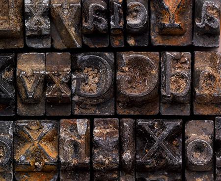
DovesType.jpg
ffi |
fl |
5m |
4m |
’ |
k |
e |
1 |
2 |
3 |
4 |
5 |
6 |
7 |
8 |
$ |
@ |
# |
Æ |
Π|
æ |
œ |
|||||
j |
b |
c |
d |
i |
s |
f |
g |
ff |
9 |
A |
B |
C |
D |
E |
F |
G |
||||||||||
? |
fi |
0 |
||||||||||||||||||||||||
H |
I |
K |
L |
M |
N |
O |
||||||||||||||||||||
What a Great story…
http://creativereview.co.uk/cr-blog/2015/february/recovering-the-doves-t...
DovesType.jpg
I’ve always loved this story. I wish he’d left the type where it was and not done the digital version, but it was bound to happen eventually.
DGM
Dan, this was done with an uncommon amount of respect. Anybody else would have made it a family and we might then be seeing car ads in Doves Bold Italic.
I do appreciate that adjustments were made after some study of the original. I’d imagine a lot can be learned from measurement of the width of the casts to establish side bearings in the digital version.
DGM
Well, I’ll step off the curb and say I agree with Dan.
This design was meant to be letterpress printed. I really cringed after reading that Mr. Green had spent 3 YEARS researching and studying samples before producing his digital design, THEN adjusted it a few times, AND THEN made more weight adjustments. After finding the original types, the most damning comment was that the last minor adjustments mostly refined the spacing (understandable) and curves. AND CURVES!!!!!!!!!!! You mean he couldn’t get them right after all those years and the unbelievable technology available in this day and age? Pretty pathetic.
But once again, this was meant to be letterpress printed on handmade paper, not digitally printed on glossy coated paper.
Rick