Another Stephenson Blake Font Help Pretty Please
We have come across another Stephenson Blake Font. I am hitting a road block just searching online as we do not have any of their catalogs.
The upper case U and the lower case y and the # 7 are a bit unique and was hoping that they would help me identify but no luck so far.
I can add more photo’s if needed .
Thanks
Kim
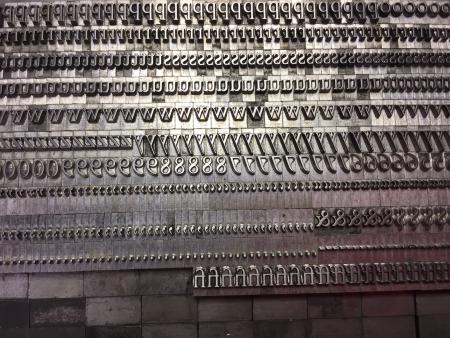
sb1.JPG
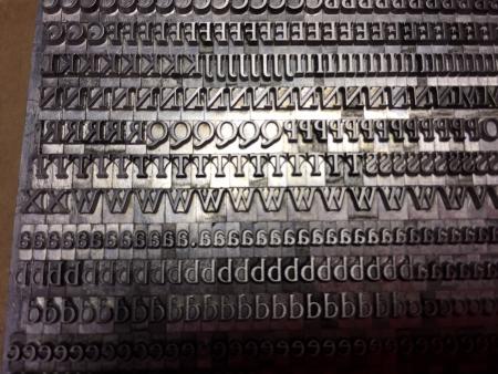
sb3.JPG
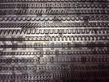
sbu.JPG
I don’t have my catalog at hand, but it looks like it might be Perpetua. I seem to recall that Upper Case “U”.
John Henry
Cedar Creek Press
Thanks John Henry.
That has the correct cap U but the lower case y and the #7 do not match.
Are you looking at a SB catalog for verification? I’ve attached a photo from a Wikipedia article on Perpetua, and the showing on the foundry catalog page shows both the “7” and “y” characters being the same as your photo.
https://en.wikipedia.org/wiki/Perpetua_(typeface)#/media/File:Perpetua_metal_type_sample.jpg
If this link doesn’t work, just look for Perpetua on Wikipedia and you’ll find this foundry specimen.
John Henry
I think that “7” may be a “ranging” figure, and in some fonts available today for the computer come standard with the “lining” figures, but the ranging ones are in the “glyphs” available as alternates. Perhaps you are looking at a Monotype specimen of the Perpetua, or if SB, one which shows the lining figures.
John H.
Thank you John Henry. you are correct.
I went to the link that you provided and it is a match.
This has the SB Co mark so I know it is SB.
I cannot remember where I found the Perpetua before but it was not a match.
Thanks bunches for your help.
Kim
Eric Gill designed Perpetua jointly for English Monotype and Stephenson Blake in the late 1920s, the design being cast in 1930.
SB altered their version in a number of ways, including making just slightly bolder.
The easiest features to differentiate M(E) and SB is that the former has hanging old style numerals and the latter has ranging or lining numerals. Also the dots on the lower case i and j and much closer to the stems with SB than M(E). The lower case y has a curved descender with M(E); it is striaght with SB, as noted up-thread. The lower curve of the upper case J descends lower with M(E) than with SB.
The italic was initially called Felicity. This reflects that the type was first used for a translation of “The passion of Perpetus and Felicity”.
Both M(E) and SB cut an italic. They have fewer distinct differences than the roman, and the SB italic is not so noticeably slightly bolder than the M(E) italic. The most distinct difference remains the numerals.
M(E) produced the roman in 6 to 72 pt; SB from 6 to 48 pt. M(E) produced the italic from 6 to 72 pt; SB from 6 to 36 pt.
M(E) also cut a bold, a bold italic, and three weights of titling.
Thank you for the info Free Presse. I will definitely make note for future identifications.
I should have stated that the differences that I described only apply to Perpetua.
I have a SB casting of Perpetua but with some unusual ‘Qu’ ligatures - I can’t find it listed in any SB catalogues - does anyone know of any on-line?
About the ‘slightly bolder’ comment, a really steady gaze at
the Yendall (Riscatype) catalogue page of the range seems to me to show that most unusually the blessed Corporation allowed Gill to have three masters from which all sizes were
enlarged/reduced. Two would have been normal. Have a look and see what you think. Bear in mind Gill’s relations ship with B. Warde at that time.