Is this Ronaldson?
Based on the beak-like serifs, I think this might be Ronaldson Old Style Italic. But the angled crossbar of the cap A has me puzzled. It’s 12 point foundry type, no identifying pinmark, but might be ATF.
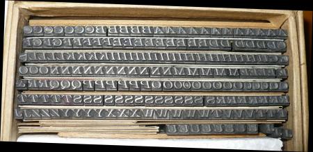
12_Ronaldson_Italic_Question.JPG
Hello Steve,
The image is showing pretty small here. Do you have it on your Flickr? From what I can see, the U also looks unlike Ronaldson.
DGM
I don’t think Ronaldson, though there may be variants. The serif ends of the E and F crossbar are unusual, and it looks like the U has “hips”. There are some Engravers Romans that have a similar feel. Unfortunately most of the showings are alphabetized by name and without the name it’s not easy.
Bob
I’ve flipped the images horizontally and posted them on Flickr.
https://www.flickr.com/photos/sos222/38815459791/in/dateposted-public/
https://www.flickr.com/photos/sos222/24943320528/in/dateposted-public/
I’ve looked at a lot of showings of Ronaldson italic in MSJ & ATF specimens, and don’t see the cap A angled crossbar anywhere.
So I think it may not be Ronaldson after all, though certainly similar.
Steve,
It was a bit of a challenge finding this, but that’s just what your type is named:
Challenge, patented by BB&S in 1888, designed by Charles Heyer.
Bob
Great looking face, but I do note that there appears to be no punctuation included in your photo.If it is indeed missing, you will have to use trial-and-error to try to find something you can use from your other existing 12 pt. fonts. At that size, hopefully the differences won’t be too noticeable.
Rick
Thank you Bob, and Rick. Bob is right - it is Challenge, though to be precise it’s “Lightface Challenge.” And to my chagrin, I actually had scanned Challenge for the Charles Heyer article in the Loy book I did with Alastair Johnston.It’s US Design Patent No. D18037, 7 Feb. 1888. Below is the image of the face from the patent.
Rick, there is some punctuation with the lower case. I had trouble uploading the lc image here.
Here is the image taken from the online US patent. It is very much influenced by Alexander Kay’s Ronaldson Old Style, a popular MacKellar typeface, italicized and with some idiosyncrasies added.
Challenge_patent_image.jpg