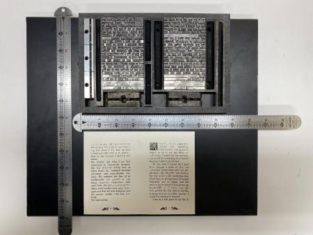
How standard is non-standard type-high?
I am a new apprentice, so please tolerate any ignorance I display. I set my first body of text along with a drop cap and some symbols next to the page numbers. I couldn’t get a good print and investigation found the drop and symbols were higher than type-high. They are .924
I am told by the supplier of these collections of symbols and drop caps that the challenges of machinery and operator in making allow only so much perfection and that any residual differences in height must be dealt with by makeready on the press.
I have once built up a particular block, but I don’t see how to deal with one (or three) blocks on a whole body of text.
So, my questions are:
1) Is this really true that new symbols or blocks are sometimes taller than type high?
2) If so, what are suggestions for dealing with this? I suppose I could turn over my whole forme and cut paper to build up the text, and cutting out small holes for the drop cap and symbol?
I have attached a photo. I hope it works.
Thanks,
-Mathias

page proof.jpg
You don’t mention where you are - US and UK are both .918, but France is .927. There are different type heights in different countries: https://ruk.ca/content/type-high-map-colonialism
I am based in the United States.
There was a time before .918” was accepted as US standard, and different foundries used different heights. The form underlay you describe to equalize surface height was a necessary practice then with mixed types.
Today I’d focus on taking high characters down to .918” standard. Working off the foot of initials and ornaments as needed (by emery paper, filing, even shaving on printer’s saw), with very careful checking with type-high gauge and micrometer would be time well-spent.
Thanks parallel_imp. I’m going to try that. I thought with a 2x42 belt sander, but someone else suggested milling so I will try that route.