crisp impression
Without opening a can of worms about whether or not medium/deep impression is “good” - I need some help on how to make an impression look more crisp. Let me start by saying I typically do not print with a lot of impression as I prefer to print with my lead type. However, a friend asked if I could do some cards for him with blind impression, so I ordered a polymer plate for these. It seems that the impression is very soft and pillowed looking and not crisp like I want it. I actually don’t care to go particularly deep, I just want it to be sharper. Is this a packing problem? I will attach a not so great photo of what I mean. Thanks - Leslie
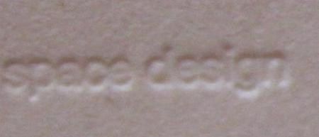
esd-1.jpg
i’d try a softer packing, not too familiar with poly dies, i would use a mag. die. Dick G.
r90sgirl
You don say what type of press you are using or the paper, both of which could have an effect here. I’d suggest a very tight packing (new, without previous matrixing) and probably not such a deep impression (to get a crisper “deep” impression). You are pillowing.
Also, you need to track the letters out a bit. Deep impression bends the surface of the paper and you need more separation of the type to prevent this. Also, the typeface itself, as a sans serif, isn’t really conducive to deep impression. Basically, deep impression is like stone cutting but to do it well you do need to read the manual.
Gerald
http://BielerPress.blogspot.com
Gerald- Thank you for the suggestions. The press is a Golding pearl (another reason I would prefer to go lighter overall) and the paper above was lettra. I was having better results with reich savoy. My packing is definitely well-loved at this point, so I will repack, and back off a bit. It really doesn’t need to be deep, just crisp and legible.
Leslie
mag die will do you better.
ericm
And just exactly what is the rationale for your opinion?
Gerald
http://BielerPress.blogspot.com
mag or better yer copper or brass will hold the egdges of the image better.
I don’t see why you can’t expect a crisp impression from a polymer plate….
I’m still really new at this whole process, but my first few times trying to do my business cards they looked like that as well - what made the difference for us was definitely the packing. We used new packing, and experimented with some harder packing to get the right look… Too much soft packing was giving us a similar impression to what you have….
ericm
I have no idea of what your experience might be with photopolymer plates but I have found the process to be quite severely accurate in terms of the ability to provide very sharp and crisp details. Far better than when I was using photomechanical engravings, which I would never have used for rendering type in the pre-imagesetter days. Though I have faith that copper engravings mounted on honeycombs bases would give photopolymer a good run for the money on any given day.
Because photopolymer platemaking lends itself readily to alternative practices, I can see where one might be led to believe it is less than desirable. Economical shortcuts will invariably result in poor results but that not need be the case.
With correct imaging output, imagesetter film negatives and photopolymer platemaking made by professionals, and quality plates and an industrial grade base, this is not really an issue.
Gerald
http://BielerPress.blogspot.com
fair enough…
this whole topic is one that is well overdue here… and I’m glad to see that crisp-ness and sharpness of impression is being discussed.
My opinion on the matter is that copper plates render the sharpest images….. and I use a LOT of copper in my work….. BUT photopolymer is no slouch, not at all. In the typesizes that 99.9% of the folks here use, I’d dare say that they are so close in achievable quality that even a trained eye could not see the difference between two well done pieces. It is only in the tiniest of types / lines that any difference at all becomes noticable. (I’m not a big fan of magnesium, however. It can often have a ragged appearence due to the grain of the metal.)
The real causes of unsharp printed materials are more related to packing, depth of impression, ink coverage and the paper printed upon….. and the skills of the people who made the plate, and print with it.
Back in the “olden days” (ie the 1970’s) ….. we always used a hard packing and hard, smooth papers to achieve the crispest images. The idea is to “always print with the FACE of the type, and not the sides of it”…… thus the old-timer’s reluctance to adopt “deep-impression” as it’s nowadays practiced. Deep impression is typically less sharp than a kiss impression on harder papers.
Without talking too much about the technical side of things, I think this project also could have been helped by some file prep before ordering the plates.
Photopolymer plates have a bit of a shelf to them, so they flare outward as you go deeper. When you look at the image above, the kerning and spacing between characters is very tight. I bet it would look a little sharper if there was a little more room between the letters, or if they were slimmed down a bit.
Other ideas? Paper is definitely a factor. There’s a variety of stocks and finishes out there, and lettra has a pretty soft finish to it. Savoy in my experience, has a tighter finish to it, so it’s natural to think that the fibers won’t feel as fuzzy and look fuzzy in the end result.
Perhaps you can dampen the paper, but who has time for that!
I agree with Vrooooom—a little more letterspacing would help. I’d start with a new draw sheet, and then hard packing, rather than soft. Hard packing will also prevent the back of the card from bruising.
Leslie,
I suggest HARD packing for this type of impression. You want the impression to occur in the paper you are printing on, not also sent down through the packing materials behind it.
The goal is to cleanly compress the fibers of the paper, not to cause it to blow out the back. So you need a soft, compressible paper stock like a cotton rag (Lettra, Savoy, etc.) and HARD packing!
Daniel Morris
The Arm Letterpress
Brooklyn, NY
Daniel-
I think I have hard packing - tympan, red pressboard, and the necessary packing from nagraphics to make up the difference. I ordered a different polymer plate and spaced the letters to allow for more room. I am printing on Savoy. It was marginally better, but still not as sharp as I expected. I’m beginning to wonder if I would be better to have my boxcar base (which takes up a lot of the chase) cut into smaller pieces for printing of business cards and smaller items. Any other thoughts?
Thanks - Leslie