Basic PMS Inks
Hello everyone,
I’m trying to figure out what I need to buy, so I can measure my initial investment on ink.
What are the bare minimum ink colors needed to mix most PMS colors?
In the Van Son website I see many colors, but I imagine, some of them are already more specialized colors that can be mixed by me if I have the basic ones.
Which colors would you recommend that I buy, that will get me most of the PMS colors, but won’t be excessive.
I’m probably going to buy them oil based for the price, and because I’ve used oil base and I am ok with that.
Thank you very much for your input.
Screen Shot 2012-01-20 at 5.49.49 PM.png
Enrique,
I have always mixed most of my ink colors. I pride myself on being able to come up with virtually any PMS color.
You can purchase a strong starter set from Boxcar consisting of the following?
Black, opaque white, warm red, rubine red, yellow, reflex blue. A luxury is silver and transparent white.
I use rubber base only and typically start all mixes with opaque white, unless I want the color out of the can, or a transparent or silver/pearlized shade.
Good luck,
Steve V
Wow, Steve, exactly what I wanted to know.
Do you use the PMS Solid guide to mix the colors?
Or do you do it by eye?
Thanks again.
This is a reasonable list of colors.
Are these the ones you use to come up with the rest?
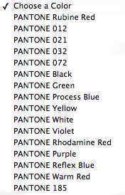
The base Pantone inks used to mix all others are
Pantone Purple
Pantone Violet
Pantone Reflex Blue
Pantone Process Blue
Pantone Green
Pantone Yellow
Pantone Warm Red
Pantone Rubine Red
Pantone Rhodamine Red
Pantone Mixing Black
Pantone Transparent White
012 Yellow
021 Orange
032 Red
072 Blue
You can mix all the colors in the Pantone book from these colors.
It used to be you didn’t need the inks starting in 0 to mix other colors but in the past few years Pantone has expanded it’s library to include mixes with these inks, so you can leave them out of a starter set if you like.
You can also use opaque white to mix with but I’ve been told to use about 30%.
Make sure, if you want true colors, that you specify mixing black. It’s a bit more neutral and a lot less dense than the black you get for black printing.
Personally, I don’t even have a base set just a bunch of random PMS numbers. I mix what I can by eye to gt about what I think a color should be. I’m not doing commercial work though.
The reason all the Pantone base colors exist is that you can mix the cleanest, most brilliant and pure colors if you use all of the bases as necessary (and as stated above, you can make all the colors in the PMS book). Artists refer to this cleanness as high chroma, or intensity. The way this works is, the closer the two (or three) base colors are that you mix a color with, the cleaner the color will be. By clean colors, ink makers mean pure and bright instead of grayish, more dull and dirty.
An example of this, taking Steve’s colors above, would be: you can make decent yellows, reds and oranges with those colors because you have yellow, warm red (a yellowish red), and rubine red (a blueish red). These colors are close to each other so they will make clean reds and oranges when mixed properly. You can also make clean purples if you use rubine red again (the blueish red), and reflex blue (which is a reddish blue). Where you get into trouble with this set of colors is with greens. You would have to make greens with yellow and the reflex blue. But reflex blue is a reddish shade, so the reddish cast in the reflex blue will kill any chance of making really clean, pure greens, (since red and green are opposite to each other).
It is helpful to be aware of what we call “the color wheel.” This is a circle drawn with the six basic colors evenly arranged around it: red, orange, yellow, green, blue, violet. If the color wheel is correctly made, red will be opposite green, orange will be opposite blue, and yellow will be opposite violet. If you put the Pantone base colors on the color wheel, they will fall in various places near, but not necessarily at, the position of the six base colors. For instance, reflex blue will be between blue and violet because it is a reddish blue, cyan will be between blue and green because it is a greenish blue, rubine red will be between red and violet because it is on the blueish side, etc., etc. When mixing colors, keep in mind that the closer the colors you use, are on the color wheel, the cleaner the mixed color will be, and vice versa.
Of course, not all customer requested colors will be the extremely pure and brilliant ones. Many of the Pantone colors aren’t. So, you may get away with an abbreviated set of bases for a while. But, if you have a request for a certain brilliant color, don’t be surprised if you can’t make it without a certain base color which you may not have.
It should be noted that mixing black should not be skimped for plain old black and vice versa as mixing black has no blue in it whereas printing black often does and therefore if ordinary black is used in a mix with a lot of yellow the colour will be toward a green tint and miles from the required shade .!
Some pressman like to use varnish (clear to weaken a shade ) in mixes but it can severely affect drying time !
Thank you everyone this is really valuable information. I’ll definitely go with a starter plus set.
You have made things very clear to me.
Thanks!