Foundry Type Identification
Hi,
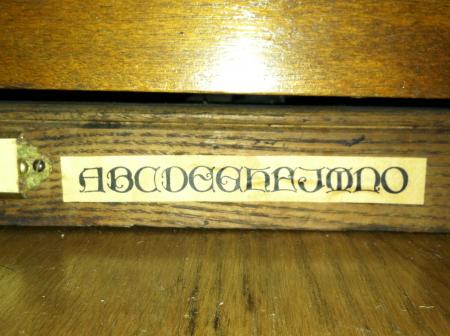
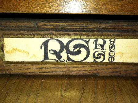
I just picked up a case of the very cool typeface pictured below. Anyone have any idea what it is? Any help would be greatly appreciated.
Thanks!
Cate
font1sm.jpg
font2sm.jpg
ffi |
fl |
5m |
4m |
’ |
k |
e |
1 |
2 |
3 |
4 |
5 |
6 |
7 |
8 |
$ |
@ |
# |
Æ |
Π|
æ |
œ |
|||||
j |
b |
c |
d |
i |
s |
f |
g |
ff |
9 |
A |
B |
C |
D |
E |
F |
G |
||||||||||
? |
fi |
0 |
||||||||||||||||||||||||
H |
I |
K |
L |
M |
N |
O |
||||||||||||||||||||
Hi,
I just picked up a case of the very cool typeface pictured below. Anyone have any idea what it is? Any help would be greatly appreciated.
Thanks!
Cate
font1sm.jpg
font2sm.jpg
The typeface is Missal. I will leave to others to identify the designer and source foundry.
John Henry
Properly, Missal Initials, which were often coupled with the lowercase for Motto both by ATF. Introduced in 1904, the design is thought to be by Will Bradley.
Paul
I know the matrices for the 12 pt are still at The Dale Guild, but I think the larger sizes are in a private collection in Belgium.
Daniel Morris
The Arm Letterpress (and The Dale Guild)
Brooklyn, NY
Thanks a million to all of you for the info. I’m looking forward to printing with it.
Nice font !
:)
Cate - keep in mind that these are designed as INITIALS and not intended at all to be printed as togther as words or sentences, etc. They really work best when used with a lowercase text font (Goudy Text, Cloister Text, Wedding Text, etc.)
In my opinion there is little that looks worse than setting a name or words using all uppercase text fonts. The Hispanics seem to be fond of using this “style” on their cars. I guess the thinking is that it is really fancy, when in fact it is damn near illegible.
Rick
I think most of the prettier fonts ,old english, german old textand scripts are all illegible when set as lines in upper case .
i was taught when you print you kiss the paper, no impression showing on the back, also never use script all caps. I have punched a few invitations deep into paper, if that what the customer wants give it to them, but the one thing i will never do and will always refuse is to set a script in all caps. you see some old english caps, Peter is right, it is illegible.