Type face
Last week I set two poems for a book I printing. I am paying for the book from type to bindery.
I set the poems and sent the proof to show the writer now it looked.
He reply had he hated the type face, and want just Times Roman for the poem.
Seeing I am paying to produce the book, (I want it to show off my typesetting and printing to get future work) I told him I dropping the project.
I am wrong?
The image is just a proof press proof, and has not been spaced out to fit the page.
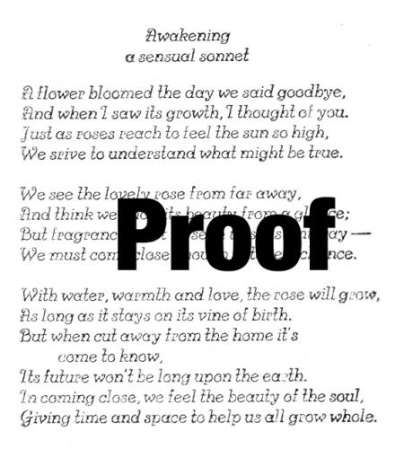
poemcopy.jpg
Hello Aaron,
I don’t think you are wrong in dropping the project if that’s what you want to do. But if you want future work, as you say, then working together cooperatively with authors is as important as which typeface you use. Even though you are covering all the production costs, the book will represent the author as much as it represents you (if not more), so he has the right to approve or disapprove the way his work is presented.
Generally it’s a matter of course that the publisher pays for all production costs — that’s what publishers do. The author receives a royalty, the arrangement for which is worked out in advance. In the case of private-press poetry chapbooks or broadsides, I think the typical arrangement is for the author to receive a portion of the product — perhaps 10%. (Someone please correct me if I am wrong.) If I were an author and hated the typeface, the last thing I’d want is a stack of books that I am embarrassed to distribute.
I can understand why the author objected to the typeface. It seems more suited to a greeting card, and since the poem is already rather flowery, a more staid face might lend a more serious tone to it. I wouldn’t choose Times, though, so perhaps you might go over your other faces with the author and see if there’s something you both find pleasing.
Barbara
Okay!
I see your point, just upset about other problems with doing this book.
I rent time and paying $2 a line to set this on a Linotype.
Already spend $100 on the two poems (I set), now I have to start over.
Aaron,
I am more the technical and mechanical printer than the artist.
I did learn that for the most part, the type should not be seen by the reader. The type is only to convey the message or the information. It is to be pleasant to the eye and not disruptive to the message. I believe a poem should sing to the reader and not depend upon the type at all. It should be as if someone is reciting the poem for you to hear in your brain.
Look at your newspaper. My guess is that very few of the readers could tell you if the typeface used is Gothic or Roman without looking at it. Whatever it is is `the right size and clean and conveys the message. It reads well. The reader would have to look at the paper after you asked the question to see if she or he could identify the style of the typeface.
If I were to hire someone to paint my house, I would wish to approve the paint color first. Perhaps you should show a prospective customer a few typefaces to select from. Keep it to just a few as more will make the selection more difficult and take much too long.
Maybe you should go back and compose the poems in a typeface the author likes. She or he might then think you are a nice guy and speak well of you. Call it an advertising expense.
I don’t care for Times Roman except for a newspaper or magazine. It was designed for that and reads well. It is invisable to the reader.
sorry folks
I didn’t think the message was so good that it should be read twice. I just don’t know how to strike one copy.
I going to set the text for the book in Baskerville with Italic.
Bold heads for titles.
At the high cost of setting the copy, I selected this face first.
The person that owns the Linotype is charging $2 a line plus rental of the equipment. And, I am doing all the Linotype work myself.
Over the past 40 years of printing, I have to redesign many ads, etc for customer that do not tell what they want until you do it.
I think I was just upset about paying to redo the pages.
Aaron:
Baskerville is a very good face for this application. If you save your fancy display types for the title page and other display composition, you can’t go too far wrong.
You might check out an essay written by Beatrice Warde, generally referred to as “The Crystal Goblet” in which she compares typography to drinking wine. It is a very good piece for all designers to read.
Good luck with your project.
John Henry
Just looked at Beatrice Warde “The Crystal Goblet”. Yes that what I was going to do with the text part.
The poem page I was playing with the look.