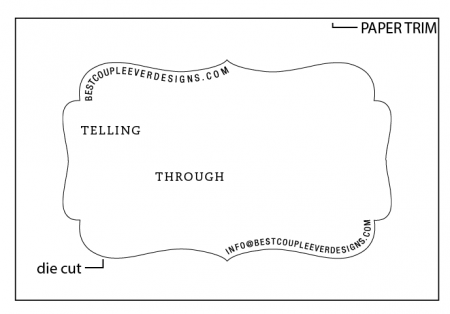
Die Cut Artwork location
Here is a quick image of a sample that will be printed.
Is the artwork too close to the edge for the die-cut? I’d hate to compromise the design in order to get it all too fit properly.
Thoughts?
Screen Shot 2014-04-17 at 4.25.32 PM.png
You might be able to do it, but you are just making it hard for yourself. Any degree of misregister at all and the unequal distances between the type and the diecut in different places, will be pretty obvious. If you allow more room between the type and the diecut, any misregister will be harder to notice.
Be sure to print first and die cut second.
Not to criticise your design, but I find the curved lines of type to be hard to read, which might be a little frustrating to the reader.
Is this one color of a two color job?
I agree with Geoffrey. I found the email address to be particularly difficult to read. You may be able to ameliorate this somewhat by using lowercase letters rather than capitals. Generally speaking lowercase is easier to read.
—
Michael Hurley
Titivilus Press
Memphis, TN
In a word, yes. The image placed in that way allows for absolutely no variance in position. If you were printing and die cutting on the same piece of equipment, you might be able to get away with it. However from the previous discussion regarding register, I had some idea that you were not doing the die cutting on the equipment you would be using to print. I would say putting the contoured type that close to the edge is putting at risk the success of the project. I’ve been a printer for over 50 years, and I would hesitate to print something like that and expect someone else to register a die that close.
Since you evidently have this in a design program now, make a shift of .010” - 015” or so in the die line position and see how evident it is. If you are jobbing out the die cutting, show the sample design to the person doing the die cutting, and get their impression of it.
Take a dozen or so samples at random from a run of something you have previously printed on the equipment and measure the variation in position you have achieved. That will tell you how much cushion you would need to build in to the design for mis-register.
With experience you learn to design-in success and limit failure when you have the option.
John Henry
I’m a designer, used to criticism. I was concerned about placement and die cutting and registry issues so I want to get it right before I go down the path.
Here’s a shot down the lowercase avenue. Thoughts? I was just trying to use the unique shape of the cut in the design but I guess I may have to abandon that.
Screen Shot 2014-04-17 at 5.59.09 PM.png
Daniel, that’s better, but you might look at opening out the letterspacing. You’ve got a whole lot of bowl characters and they visually run together.
I’m guessing this is a business card, yes? If it were me designing this, I’d ask myself whether I want to focus more on making this eye-catching/unique or readable. I’m not saying one or the other must always be of paramount import or that the other can be totally ignored, just that you should make a conscious choice about which is more important to this project. Eye catching may get people’s attention. Readable may make them more likely to use the card. But rarely is it possible to have both in equal measure.
—
Michael Hurley
Titivilus Press
Memphis, TN
It is better, but I would move it away from the edge even farther, like 1/2 inch instead of 1/4 inch. You would have to move TELLING down too, of course, to do this.
Regarding the legibility, I think what messes it up, in part at least, is that COUPLE ends with a vowel and EVER starts with a vowel. This makes it hard to determine without some mental trial and error, what words are there. In contrast, BEST and COUPLE are easy to figure out, as are EVER and DESIGNS, due to the consonants between them.
As a tongue-in-cheek aside, this reminds me of the long standing difference of opinion between the designer exercising his/her artistic license and the production printer trying to get a job which can be produced economically and successfully :)
Best of luck to you!
I am going to shot straight. Poor design! Hard to understand, I have looked at it for a few minutes, And do understand it.
A person you hand your card to, will not understand it. I have been in printing and marketing for 50 years, Everything a future customer looks act, has to tell them what you are selling, and that the customer can’t live with out it.
Here is what people will say when you hand them the card, “nice, than they will never ask you about anything. When a person says nice to you when you show them your work, they are really saying, Nice that you handed me this, but, I do not know why!
And, as a printer, type has to be 1/8” to 1/4” away from the edge, are the die cutting will hit the type.
You might get 8 out of 10 good cards.
Aaron, I think we are seeing only one colour of a two colour design. There’s another thread where you can see the missing colour:
http://briarpress.org/38239
Yes…sorry. I was just getting the die-cut info here in the thread. And too lazy to snapshot the other portion. Though I’m going to take your suggestions to heart and rework the curving text.
Thanks everyone for the info! Super pumped to get printing!
I know camel case is … ugly, but the one place I find it is useful is in multi-word URLs:
[email protected]
vs:
[email protected]
Takes it from being a long string that’s hard to read, from a smooshed-together but distinguishable series of words.
Do a quick test-mail to both versions of the e-mail address to make sure your server isn’t overly-picky, but I wouldn’t expect any problems.
Aaargh, that should be “*to* a smooshed-together but distinguishable series of words”
Proofread, idiot self, proofread proofread proofread…
The difference between running commercial (on a Heidelberg 10 x 15) and register are projects like this.
No reason you can’t run the job as tight as you have it, if you are creating the die line with the layers of the card, you should have a die that is dimensionally accurate—then it’s up to the operator to get it to register(!).
One thing to consider: if this design is meant to use heavy impression and is on soft stock, you may have conflicts of the cut rule running through areas where the stock is deformed by the impression. On harder paper, this should not be a problem.
If the idea is for the copy to be a lead in to have people go to the website, then a redesign might be prudent to make the connection more obvious—much will depend on the design elements not shown in the image.
I feel like the radius at the beginning and end of your respective top and bottom lines is more suited to skateboarding than graphic interpretation of typography; I think you should not only make the shape of the card more graceful, but the typography as well. As has already been mentioned, also; I think you need to track the letters out a bit as well, they’re too close together.