Pantone 377U color issues
Hi there,
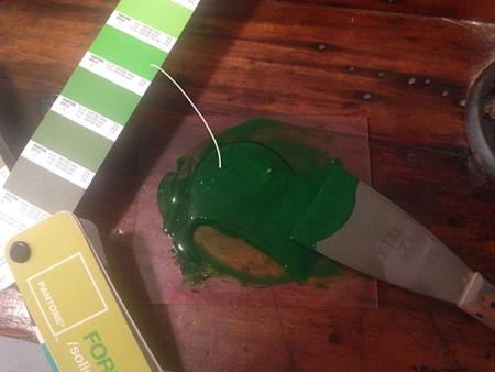
I’m trying to mix pantone 377u. I used the formula that’s in the book and it came out super dark. I tried mixing two swatches up (375) on the strip and it’s still super dark (see photo).
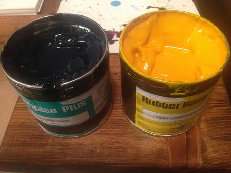
I’ve mixed this before (but didn’t write down anything I might have done differently) so I’m confused as to why I can’t get it to mix correctly. I’ve double checked and made sure that I’m using the correct amounts. It seems like the green in the can is just too dark. I’ve attached a photo of the cans of ink also.
Any thoughts?
IMG_6623.jpg
IMG_6624.jpg
Have you actually printed with this mix? Or just mixed it and it seemed too dark? If the latter, ink can look darker when mixed but it’s really the right color once printed.
dip your finger in it, stipple it on a piece of paper (preferably the paper that you will be printing on) and check. Don’t forget that Pantone swatches are printed under ideal circumstances on an offset machine in a very thin strip of ink, and not on a letterpress machine. Use your own judgment and/or educate/explain your customers!
I haven’t printed with it yet - it’s still mixed, but I never did ink the press up. I did stipple it and it seemed off somehow. It’s a project for myself, which is good - the only problem is that I’m trying to match something I printed a couple months ago with the same color. I think I’m going to ink the press up and see how it does print.
Isn’t it a different “recipe” for mixing actual ink (based upon weights), vs. the RGB or CMYK specs they provide in the designers’ swatch book (which are based on weight or numerical RGB scales)? The designer book may give you proper color for offset files if you speced the colors in an electronic file, but not so if you actually are mixing physical ink colors…?
Yeah it is, I’m mixing it based on the weights for each color - 377u is 12g yellow, 4g green and 1g black.
You can also put some on your ink knife, put the blade on the paper and pull it along the surface to get a simulation of what you’d get on press. Essentially an ink draw down. That might help as well. I never go by what the ink looks like when it’s all blobbed up.
“What did you use for the black? It is supposed to be “Mixing Black”. If you just used regular black ink then the color will be too dark.
I decided to ink the press up just to see if the blob of ink was really throwing me off and unfortunately, it is darker than it’s suppose to be. In the photo below - the card on the right (nebraska) is the one I printed a few months ago. The new one on the left (vermont) is the new one printed tonight. You can tell it’s much darker and not as much of a muted color.
I did use mixing black for the black. Not sure if this matters, but the pantone green was super thick but I don’t know if that would have changed the color.
I may clean the press and remix pantone 375 (two up on the swatch book). The only difference is 375 doesn’t have any black in it so that might help with it being so dark.
IMG_6625.jpg
If you are going to be using this ink for a series of cards, or so it appears, why don’t you order a pound of it from an ink supplier so that the color is consistent? Mixing small amounts by weight is difficult, and green is a difficult color to match exactly, as it tends to dry darker than the color when applied.
Paul
Since the Pantone mixing guides are formulated for offset printing I’ve found we have to go way away from the guide on many occasions to get a good match. I think of the specified mix as being a starting point to get in the ballpark.
In my experience opaque white has also been key. It’s really difficult to maintain an ink film precise enough to stay on color with letterpress printing. The transparency of the inks means that if your film is thicker you’re significantly darker or if there’s less ink on press you’re way lighter and in many cases you’ll get a color shift as well. Your dark blue will shift to green as it gets light for instance. Adding a bit of opaque white to bring the mix to shade and also cut the transparency makes it much easier to stay on color as the volume of ink doesn’t make it that much lighter or darker.
I’ve also never been able to mix any of the Pantone blacks (6U, 5U etc.) without using opaque white.
Agreed with Paul/Devil’s Tail. If you’re going to need consistency from job to job, over a long period of time, buy a can of mixed ink. Saves much heartache and eliminates one of your variables.
Yeah, that is something I probably should have done in the beginning - just order a can of the ink. Lesson learned.
Thanks for the tips nervous_john. I usually only use opaque white (instead of transparent white) but good to know about the shifting in color.
it happens sometimes when you use light colors if you forexample mostly use black on the press that you need to ink the machine with yellow and wash a couple of times as the residual black or whatever darkens the formula you will notice the yellow changes color pretty fast.i work in a 4 color offset press and when mixing a pantone i try to use the battery with the most similar color for example for lighter colors or varnish i use the yellow tower for greens the cyan tower reds magenta tower and so on this prevents the washups