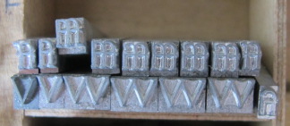
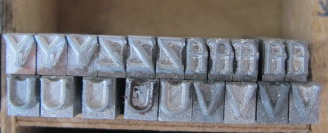
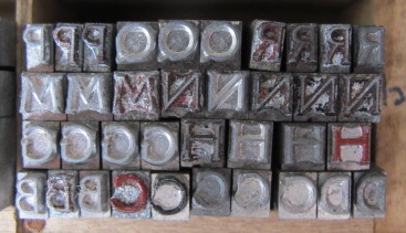
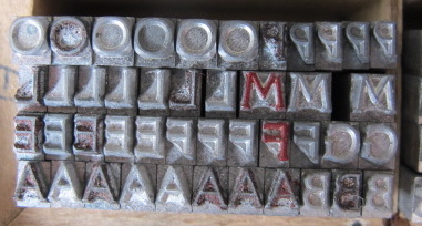
Type identification sought
Dear all, I am an absolute newbie to letterpress printing: I have only just bought an Adana 8x5 and a batch of type. Most of the type covers Gill Sans, Univers, Times, but some were described as ‘and some others’…
I really would like to know what type the attached is. I have searched both online font sources, looked through the yellow FontBook, some 20s and 30s catalogues, but to no avail.
I would really appreciate it if somebody can point me in the right direction!
Thanks.
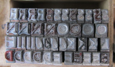
IMG_2865.JPG
IMG_2866.JPG
IMG_2867.JPG
IMG_2868.JPG
IMG_2869.JPG
IMG_2870.JPG
It looks like your type has some oxidation… Where did you buy the press and the type? In the US, UK or continental Europe? A printed version would make things easier.
It looks like Monotype Canterbury (Series 197) but there’s clear evidence of corrosion. Canterbury was withdrawn in 1967 but it sold well and there are still lots of matrices about. Canterbury was a close copy of Thomas M Cleland’s Della Robbia (1902).
I don’t think this is English Monotype’s Canterbury. That face is a rip-off of ATF’s Della Robbia.
Though pretty well oxidized, I think this puppy just seems “thinner” so my guess is that you probably have Della Robbia Light, which was designed by ATF around 1913.
The Della Robbia Light is something I rarely (if ever) ran across in over 40 years of gathering fonts for my own press.
I personally like Della Robbia and have several fonts of it in my shop, but an interesting tidbit is that Thomas Maitland Cleland claimed, late in his life, that he actually regretted ever having designed it!!!!!!!!! He was an absolutely fantastic design and illustrator in his day and is well worth looking-up for the current generation. Absolutely dazzling.
One more thing, he wrote an essay titled “Harsh Words” - as true today as they were then. Ah, the human condition.
Rick
Thank you both very much for your comments!
Some of the type is very dirty: which letters do you suspect corrosion to be on? I assumed the red letters to be stained by ink.
Thomas: The type and press were bought from different sources in England. I have no printed version as yet, as I have not gotten all the equipment together!
InkSprite: Monotype Canterbury/Dell Robbia is very likely, judging by the Della Robbia image I found online following your suggestion! What makes you lean towards Monotype Canterbury (for which I cannot find an image)?
Rick: thank you for your comment too! It is fascinating to read about all these typefaces: I have been looking through typeface specimen books for the last two days now!
The fact that this Della Robbia Light would be amongst a batch of Univers/Gill Sans/Times seems odd, if it would be so rare to find. I am intrigued!!
I also can’t wait to actually print with it. Will look up some safe instructions on how to clean the type…
Thirza,
The type pictured appears to be American Type Founders Della Robbia or an equivalent. Stephenson Blake (England) copied Della Robbia and called it Westminster Old Style. It may be that Westminster is what you have there.
The thinner version, Della Robbia Light was made by ATF for a very short time, and like Rick, in my 45+ years of collecting type, I have never come across any of it. Damon and Peets Foundry had an equivalent typeface to Della Robbia Light and they called it Armstrong.
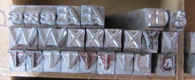
Your photos do not show a lower case other than the ligatures - do you have the lower case characters?
My shop has large fonts of Della Robbia in seven sizes. It’s one of my favorite typefaces.
Michael Vickey
www.nickel-plate-press.com
Michael, thank you for your comment! The only lower case bar the ligatures were one o, one e and seven 1.
Is there any differences at all between Westminster Old Style and Della Robbia that I could look out for? To the untrained eye, the letters on the images I found online of the two appear the same…
It is clear enough though now for me that it is strongly linked to Della Robbia!
Thank you all for your help!
IMG_0256.JPG
I have a font of ATF 18-point Della Robbia Light and think that the subject caps matches that, except for the slight bow in the leg of the R, but I would put my money on an English casting. When I checked the showing in McGrew, I noticed that his showing was missing the alternate characters, which it should have shown. My only English specimen is a circa 1910 Caxton, which predates the light design.
Dave Greer
Here is my ID card showing ATF 18-point Della Robbia Light:
https://www.flickr.com/photos/39182740@N04/34401147145/in/dateposted/
Dave Greer
Duplicate Posting
While I don’t have a similar font, lots can be learned by showing the side of a character with the pinmark of the foundry and the nicks at the foot of the type body. Perhaps that photo would give some of these type gurus a chance at deciding which foundry was the source.
John Henry
Cedar Creek Press
On John Henry’s note I should add that recently the Skyline Type Foundry has been offering fonts of Della Robbia, cast on Thompson casters, so there will be no pinmark on these fonts.
The name Della Robbia is derived from Fra. Luca Della Robbia, a monk whose lettering Cleland had seen and admired when he was in Italy and based his design on. (This is all from my memory and I should admit that I am currently enjoying a rum n’ coke as I realx after a long day’s work.)
Rick
Dave: thank you for linking to your ID card! The finial R is missing from my set, but then I wouldn’t know whether the copies would have had the finial R! It is a lovely font.
John: I will try and get some more images later today with better light and magnification, also of the body of the type.
Rick, don’t tell me those things: I have only a very limited budget !!! ;-)
Some better images of the type capitals from more sides. I don’t think there are any clues, but I would be happy to be surprised!
IMG_0306.JPG
IMG_0305.JPG
IMG_0304.JPG
IMG_0303.JPG
IMG_0302.JPG
IMG_0301.JPG
IMG_0300.JPG
Since nobody has commented on the last pictures, they look like type cast on a British Monotype composition caster.
Thanks parallel_imp, the square nick is not something commonly seen on this side of the Atlantic.
Rick