I know it’s a tiny fragment…
… But I’m trying to help a friend out of a scrape, and you guys are clearly the best people to ask here.
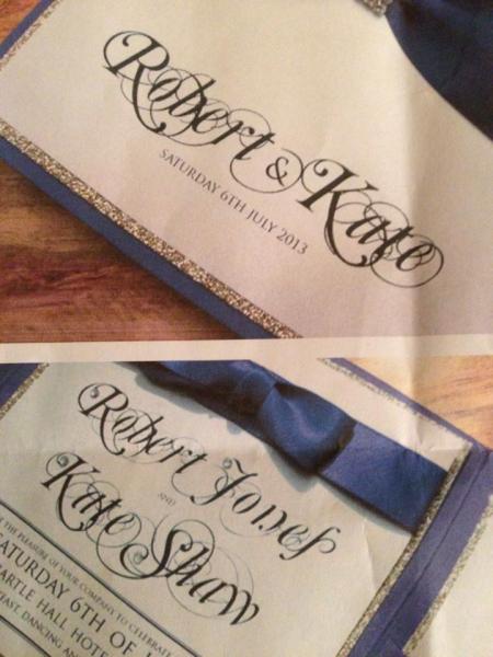
Does anyone have a clue about identifying the attached typeface? We don’t have any more to go on than this.
Would be really grateful for any help.
Thanks,
Vicki
received_m_mid_1392334833483_6a6c3cb27c7936a589_0.jpeg
Looks to me like some variant of Caslon Italic with swash caps. The long “s” at the end of the name “Jones” is an alternate character (or quaint character), which has not been used routinely since about the year 1800. The ampersand isn’t Caslon I don’t think…. it may be Garamond. All the swirls (fluorishes) may have been put in by hand electronically.
I would think that most of on this site are firmly rooted in analog type. What you are showing most certainly comes from the digital world. I agree with Goeffrey that it looks to be firmly based on Caslon or Garamond Italic w/swash.
Rick
Not any help to you Vicki, but perhaps some unsolicited advice for future designers.
I think the names would look very handsome without the flourishes.
I note the now all too common use of ALL CAPS for the rest of the invitation. That hurts the eye of this old guy. The type designer included lots of nice lower case letters that he intended we use.
I’m with you, Inky - on both counts!
I cant imagine this face would last long with heavy impression!
I agree with Peter, its Caslon, but played about with on the Mac…!
This is not letterpress to my mind.
Its way too busy for my tastes and is actually quite hard to look at for any length of time.
We don’t use the convention 6th of whatever month here either. You would simply state Saturday 6th November. The of is redundant.
I’m from the less is more school I’m afraid.
The type looks a lot like this particular version of Caslon http://bit.ly/1ouDdIT but with lot of gratuitous scrollwork scribbled over the top. It isn’t to my taste, but if they like it, they like it.
DGM
Yes, that does look like Caslon 540 Alternative Swash Italic. The smaller typeface appears to be Trajan, which would be why there is no lowercase.
—
Michael Hurley
Titivilus Press
Memphis, TN
The swirls are loosely based on the flourishes and swirls so beloved of writing instructors’ manuals of the mid seventeenth century to the early nineteenth century. Needless to say, the penmanship manuals they produced were not printed by letterpress, instead being printed from engraved copper plates.
The letters themselves bear limited resemblance to the styles employed in writing manuals, being based on typefaces as noted above.
The result is an amalgam of letterpress letters with hand caligraphy swirls and flourishes from an earlier period added on.
Some late nineteenth centuty type founders did offer electrotype blocks not dissimilar to this effect, but limited to a very small selection of words and abbreviations such as “Cheque”, “Bot. of”, and other commercial terms, the blocks being in very concious immitation of copper plate engraving.