Help with font
Hi,
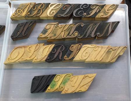
I have been sorting out 1000 pieces of a Delittle script in many sizes. I still have a long way to go but have no reference and am struggling with some of the letters.
I have flipped the image in photoshop to make it easier.
Is it an I or J
I think P & Q are wrong
Can anyone help as to what these letters are and which one is missing?
I still have boxes to sort so am sure they are all there but am struggling to identify a couple of them
Not even started the lower case ones yet!
Many thanks
Delittle 2.jpg
Now I look at it again I can see some mistakes
I think my eyes must have been going crazy after sorting for hours.
The L i have is an upside down J
The P should be the L
The ones i’m stuck with are:
the one to the left of the R, is that a Q?
Is the S correct?
Many thanks
The character to the left of the “R” is a cap “I”.
The “S” is correct. You do not have a “Q” in the set you photographed, but it should look like the “O” with a slight tail.
Maybe this will help
http://www.identifont.com/list?17+id+6.0+8LM+2+5YK+2+KNE+2+MRZ+2+7YR+2+4...
It’s not the same, but gives some idea of most of the letterforms
This is a closer match: http://www.identifont.com/find?font=Palace+Script&q=Go
Great, thanks everyone. that’s a big help, should be a lot easier now.
Best regards
Steve
I couldn’t find a full alphabet specimen, but took a couple of quick shots of its pages in the DeLittle catalog I have.
It is called “York”, in case you didn’t have a name for it. Maybe that can be of help?
york2.jpg
york1.jpg
Great pictures… Nice type specimen!
Great, thanks for these, its good to have the name of the font. Will finish sorting today, there must be 5 or 6 sizes in the boxes but doing the large ones first.
It’s actually called York Script and DeLittle did two versions of it, No. 1 and No. 2, with the latter being slightly more condensed than No. 1.
The size required was specified by the customer and adjustments were made to the pantographic cutter to give the exact size requested.
InkSprite, you are correct.
The top of my photos is of No. 2, the bottom is No. 1.
“It is cut to any size from 5 and 20-line”
Delittle were remarkably innovative.
I think I recall that wood letter was commonly sold as a so many dozen fount. i.e. ‘a three dozen fount’ and so on.
One trick to sell cheaper was not to supply Q as so rarely needed, unless specified for. Of course Scots could ask for Mc as a ligature as available in some faces, but of course had to pay for it ! Figure sets sometimes were sold varied by the year. i.e. just prior to 1900 you got an extra 0
I know it’s been some time since the original post, but I’m nearly sure that the character in the 3rd line, 6th from left (i.e. In the T position) is the upside-down Q.